Product Design Case Study 2024.
Section template for company CMS system.
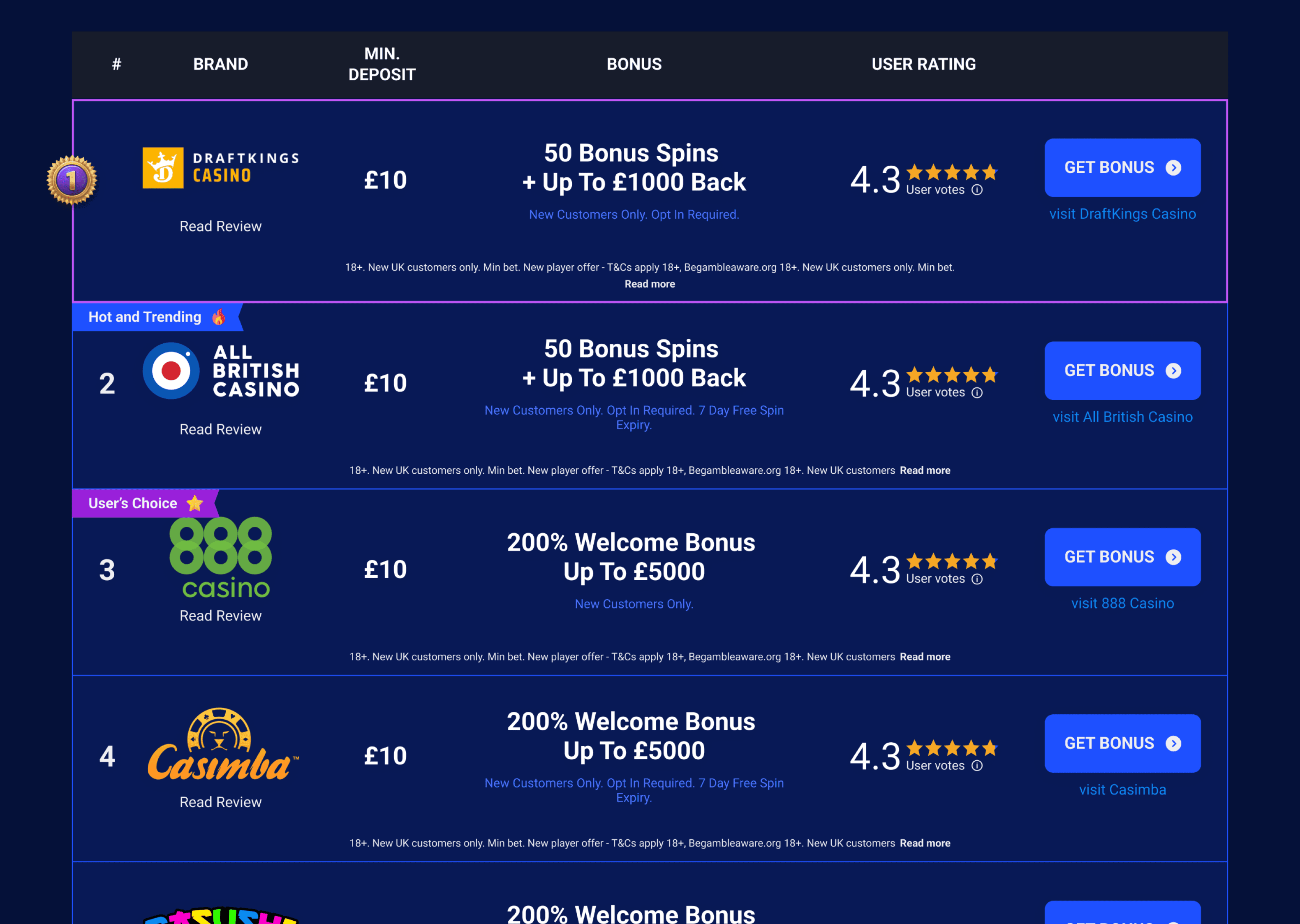
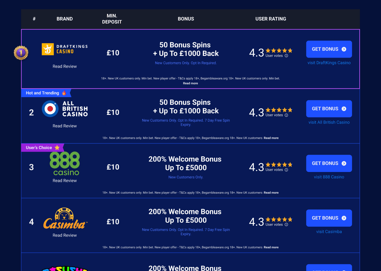
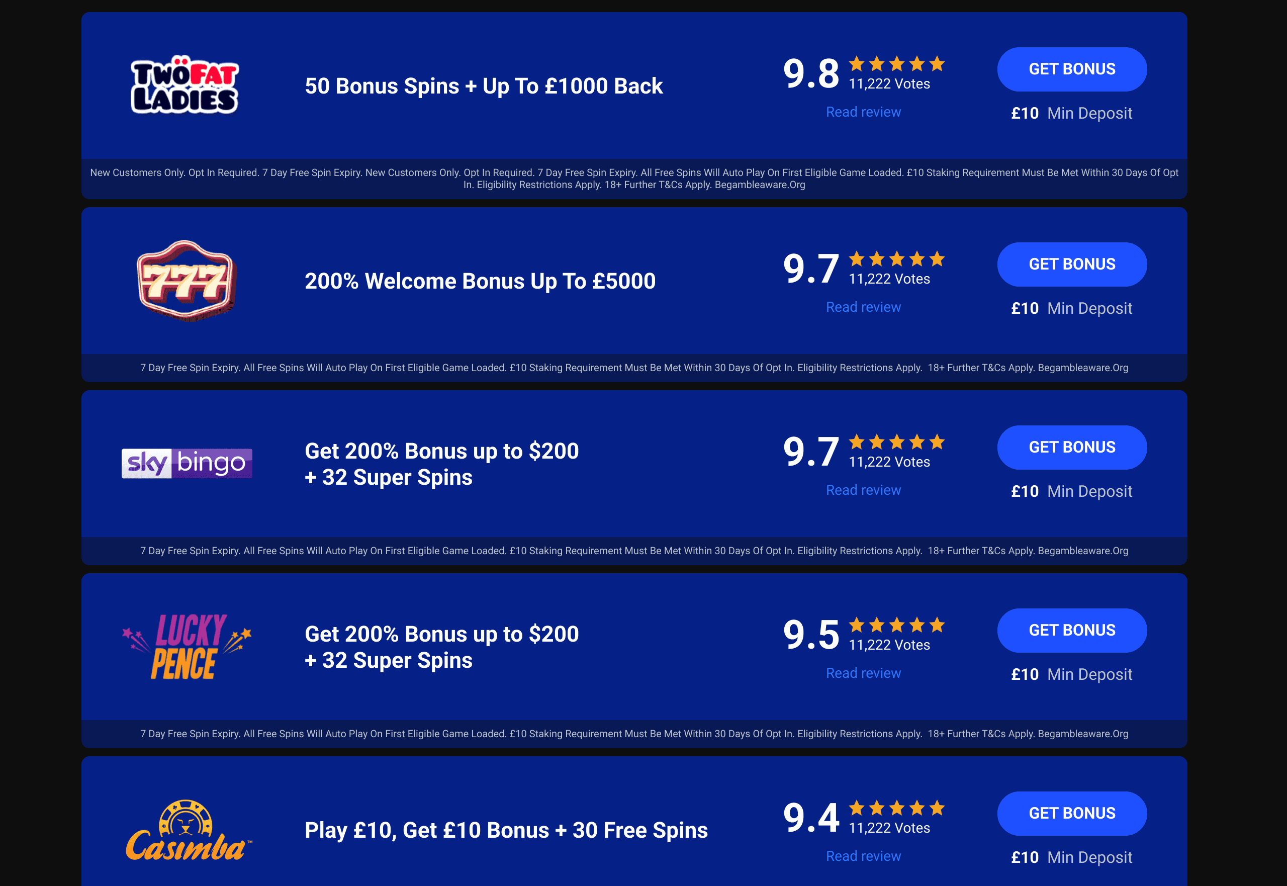
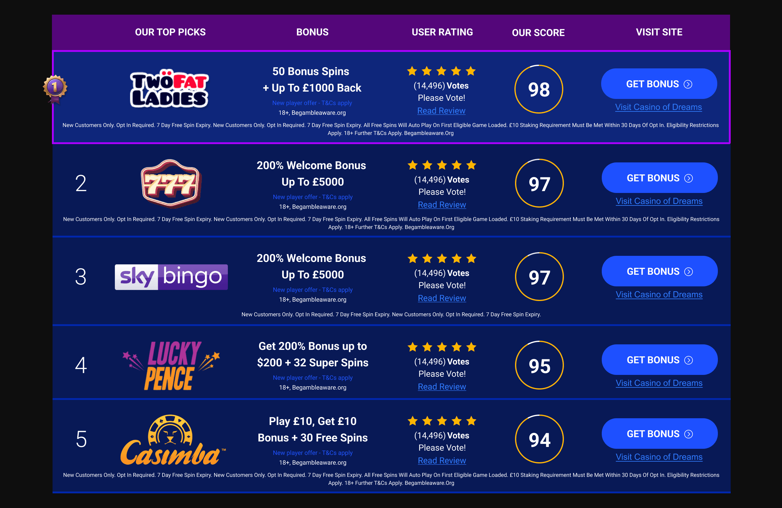
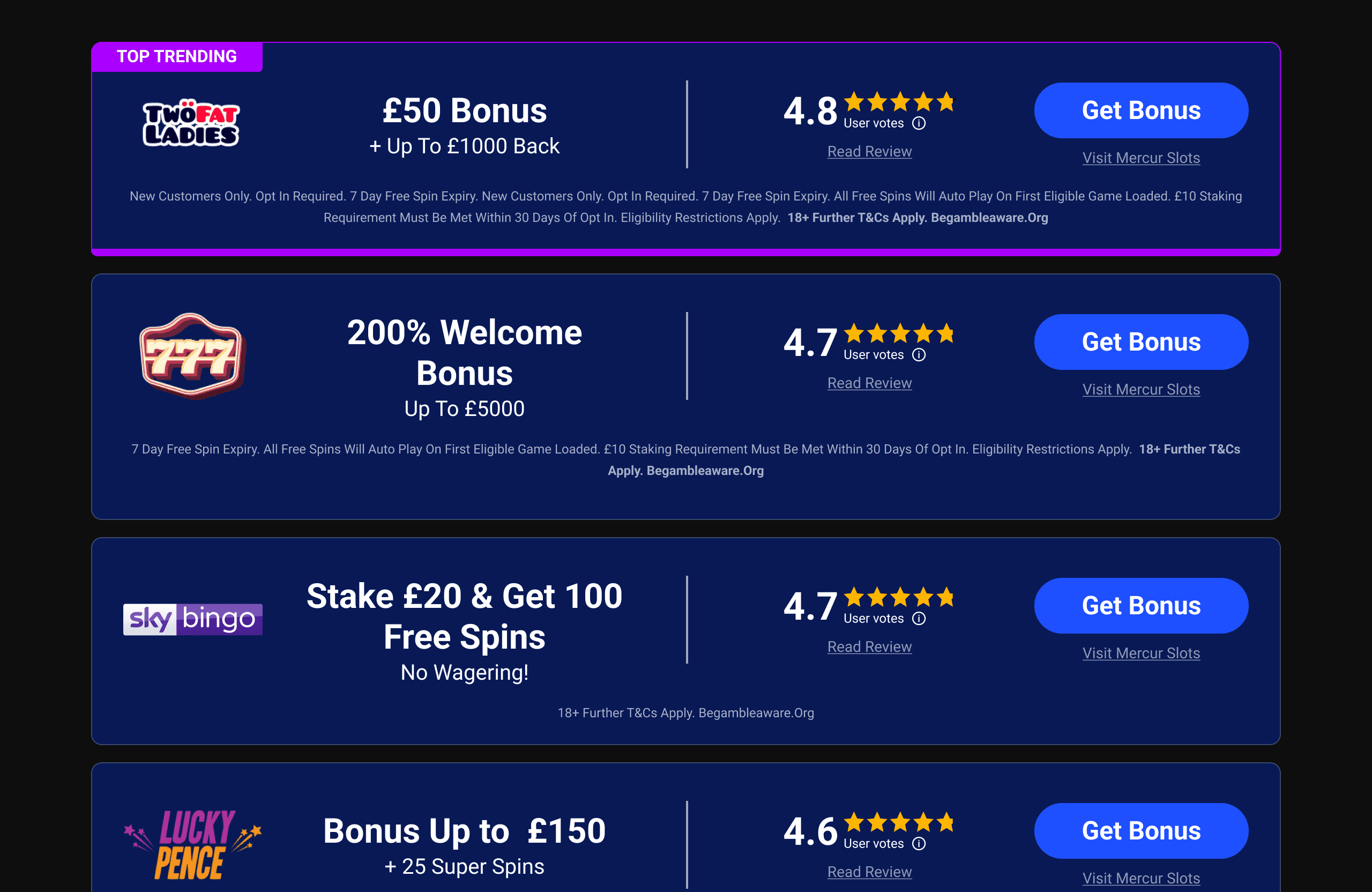
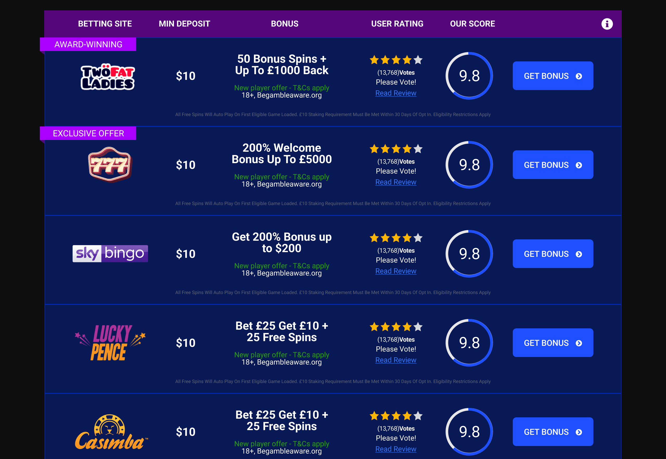
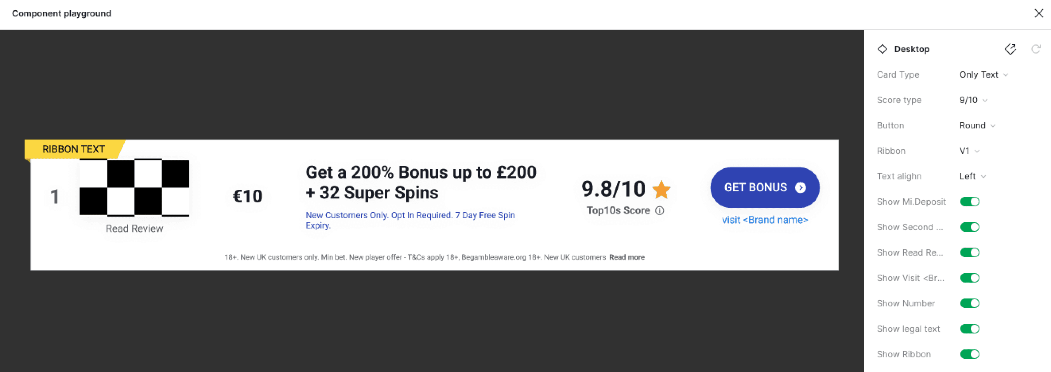
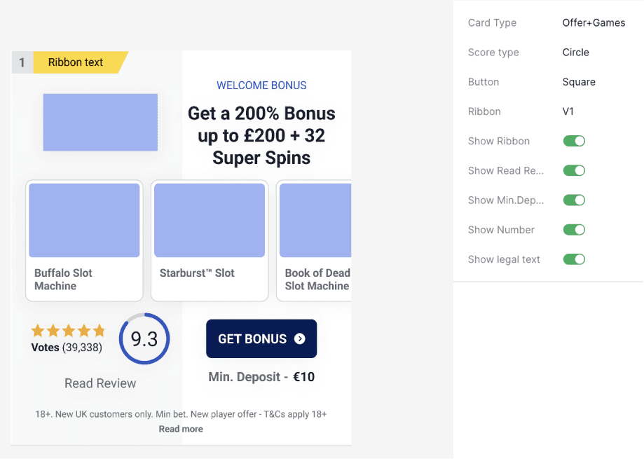
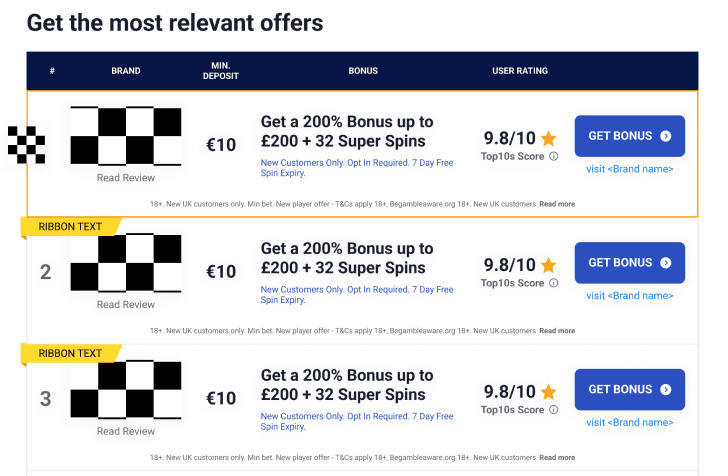
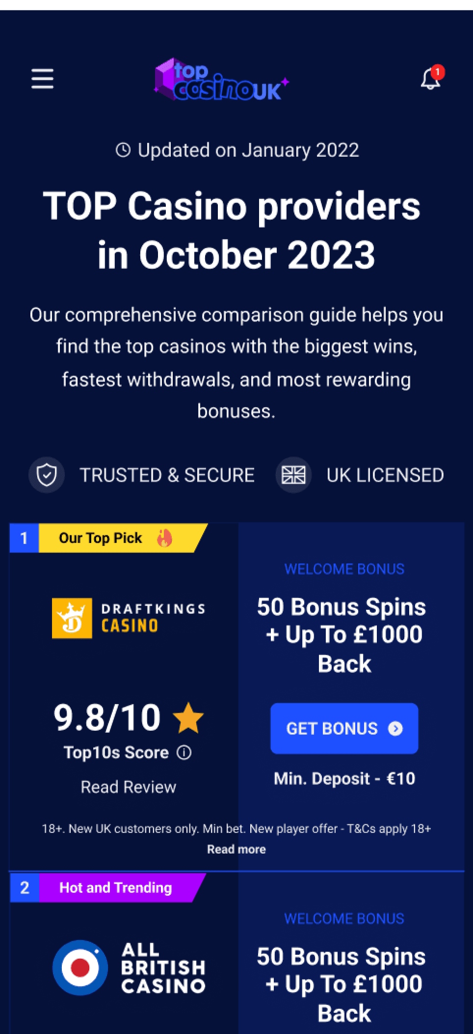
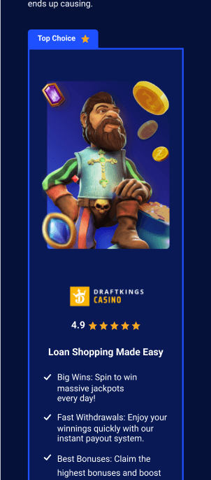
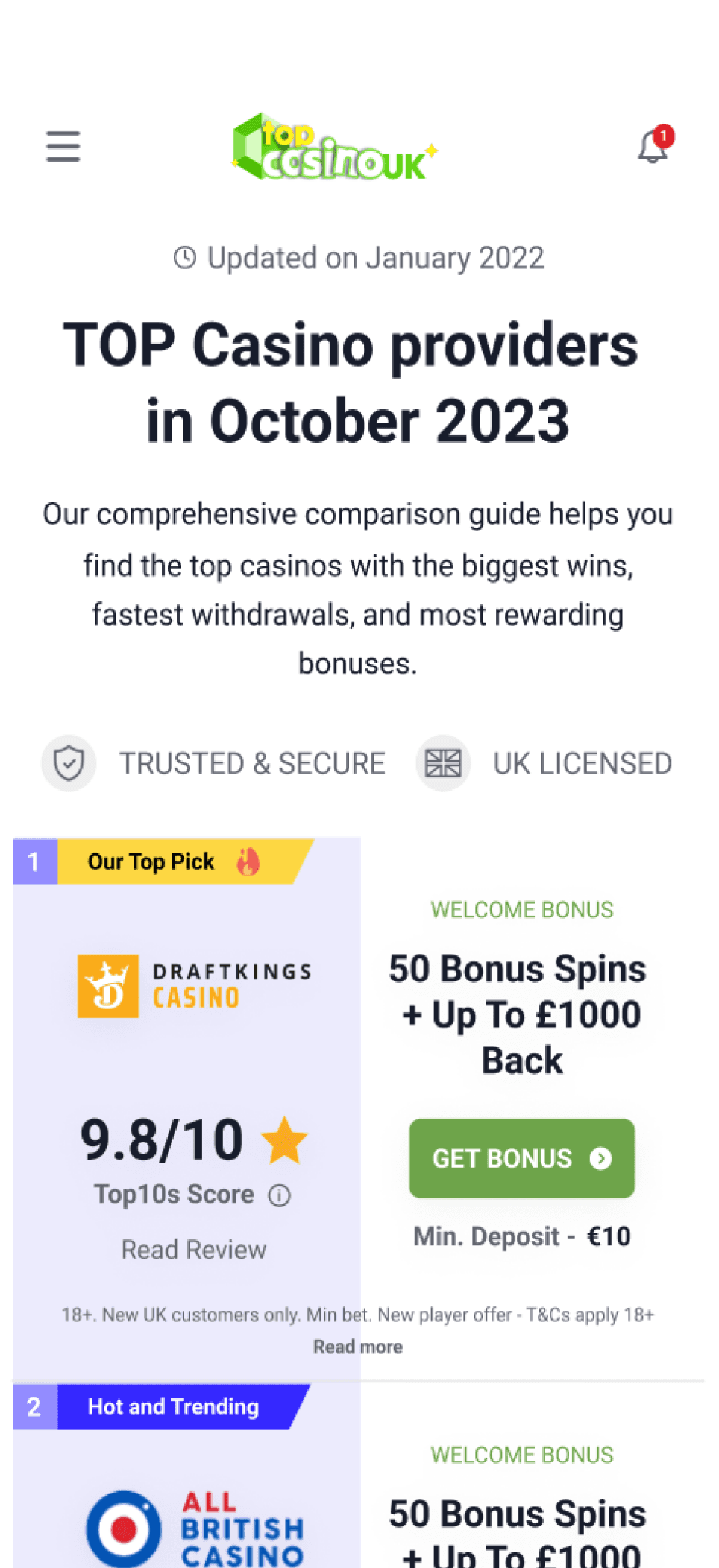
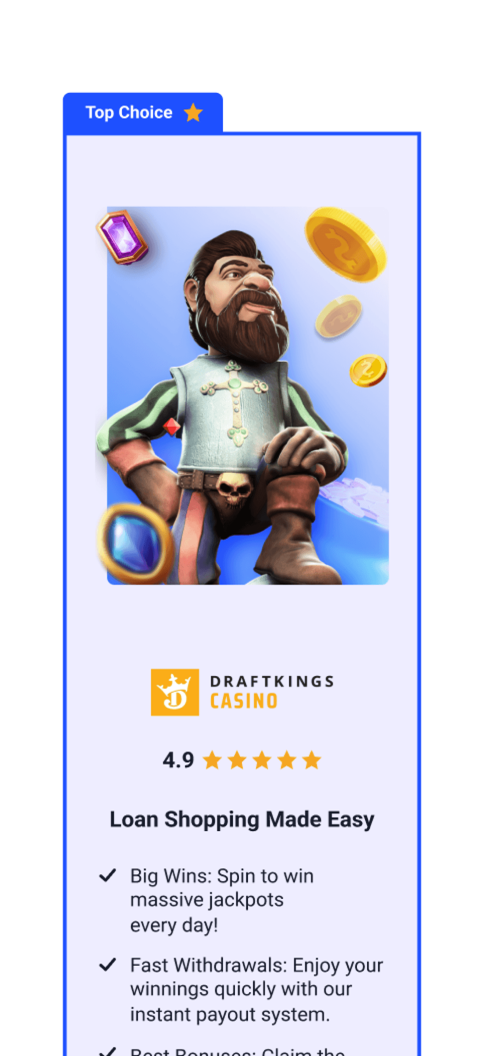
Compare table offers customization through Ribbons, Buttons, Card layout, Score Type, and Text alignment.
Combine parameters to create diverse
table options.
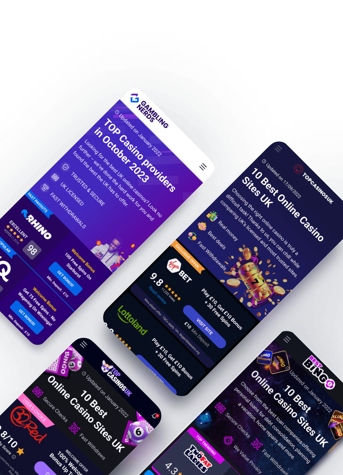
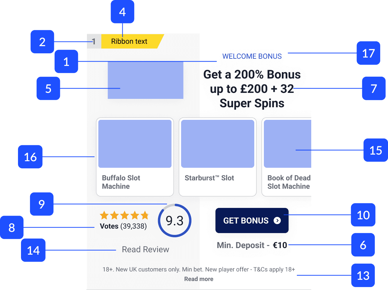
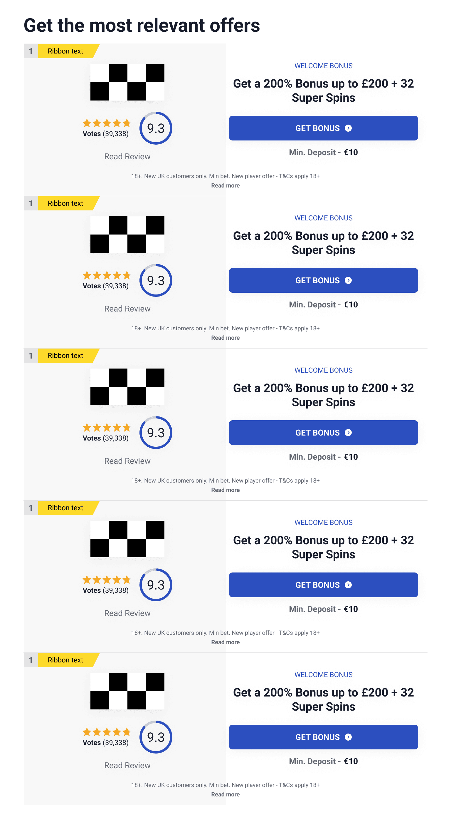
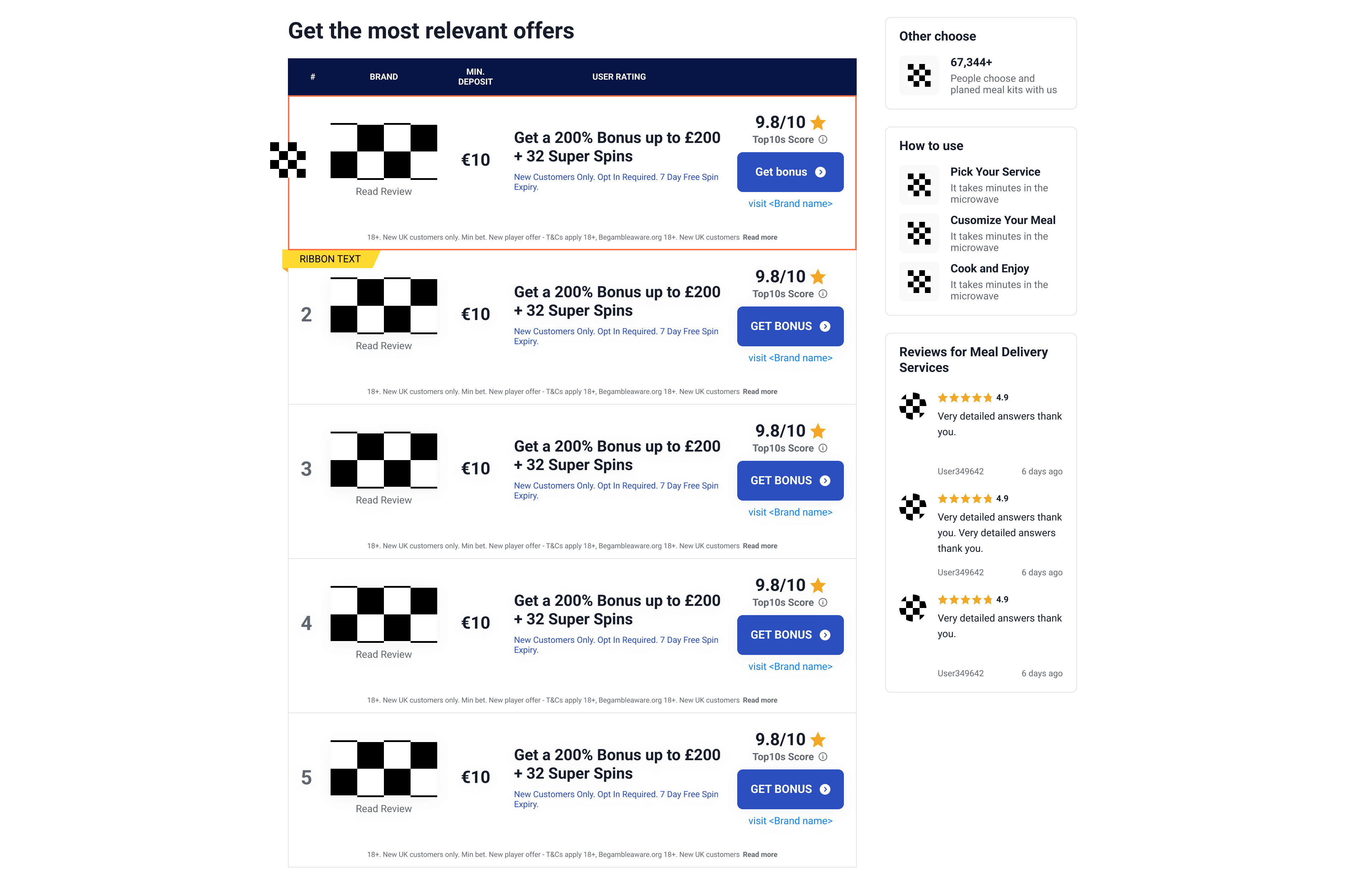
Template designed for Desktop, Desktop with sidebar, Tablet, and Mobile devices, ensuring seamless integration.
About:
Multiple affiliate marketing websites are supported by the company through a custom CMS system. These websites function as resources for users exploring online casino options, providing detailed insights, comparisons, and promotional offers. Simultaneously, they operate as affiliate marketing tools for featured casinos.
Problem:
The website builder system currently features four similar but underutilized compare page sections. This underutilization results in increased difficulties in system support.
Solution:
A solution is proposed to create a single section inheriting properties from existing compare tables. This ensures flexibility for use across different affiliate sites, addressing the underutilization issue and simplifying system support challenges.
Product research
Competitors research
User Persona

Card Wireframe
Compare page Wireframe
Dark version
Light version
Project limitations and guidelines.
Existing
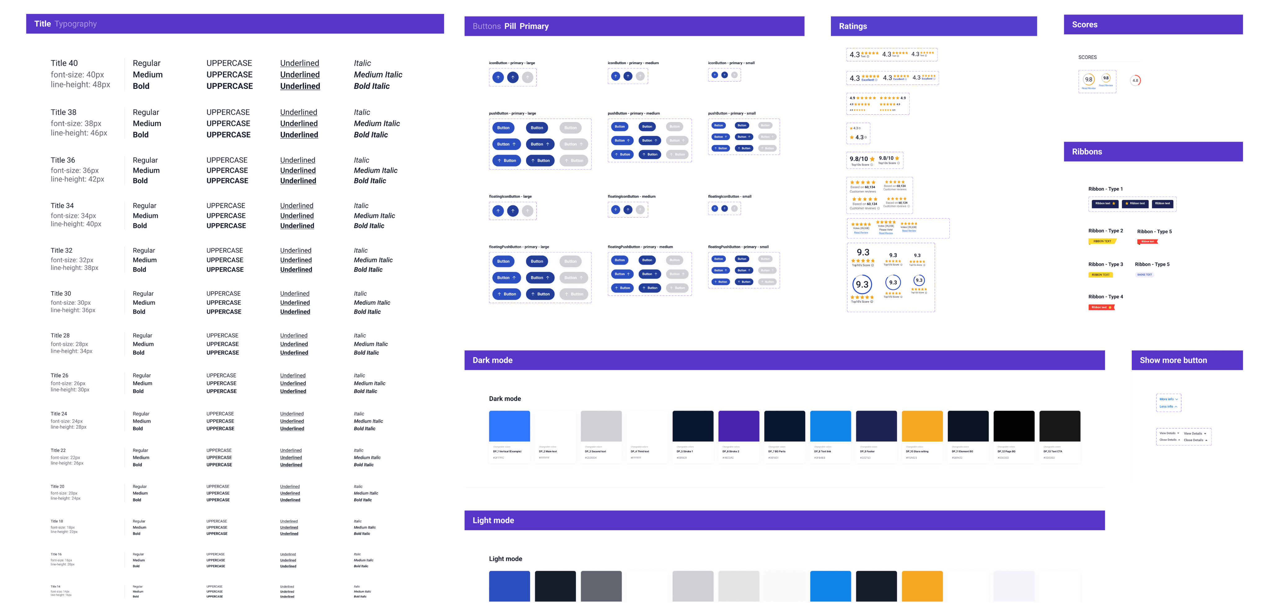
Design System
The new section has been created using only existing and developed
components.
Color
attachment logic
To create seamless transitions between Light and Dark themes, color attachment logic was taken into consideration.
Knowing in advance that some features would increase development time, dubious features were excluded from prototyping.
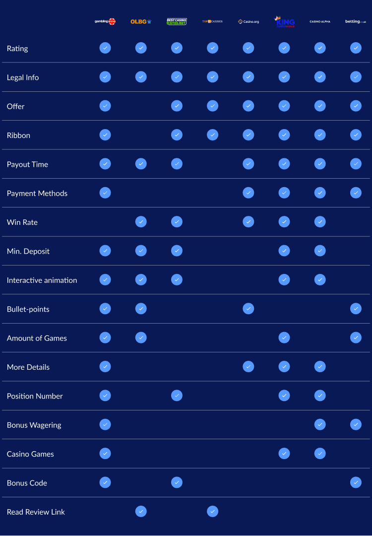
In the examination of four current compare table templates, a compilation of parameters and features that should
be inherited by the new section has been undertaken.
01
02
Main offer
Basic functionality. Positioned as the primary focal point for the user.
03
Score
Basic functionality. Multiple options for different score types are sourced from the Design System..
04
CTA
Basic functionality. Various button options are available from the Design System.
05
Legal Info
Basic functionality. Should have a "Hide" option to minimize space usage.
06
Read Review Link
Basic functionality. ontains a link redirecting to the review page.
07
Table Header
Basic functionality. Inclusive of an "Info" section.
08
Highlighted Card
Additional. The first card should offer an option for an icon and stroke.
09
Min. Deposit
Additional field. Provides an option to emphasize deposit choices.
10
New Customers info
Additional field.Offers an option to highlight the special offer for new customers.
11
Ribbon
Additional field.Incorporates multiple ribbon options from the Design System.
01
Casino Games
Users often search for specific casino games. Implementing this feature may increase the likelihood of user interest in offers related
to these games.
02
Interactive Animation
Drawing on our experience, the incorporation of interactive animation has been chosen. Such animations have demonstrated an increase
in user engagement.
Analysis | User Research

James Smith, 28
UK, Birmingham
Freelancer
Goals:
The identification of the most rewarding online casino experiences in the UK.
Maximizing bonuses and promotions offered by online casinos.
Discovering new casino options with bonuses for new players.
Pain Points:
Research on multiple casino websites is time-consuming.
Concerns about the reliability and trustworthiness of online platforms.
A desire for a simplified and efficient way to compare features, bonuses, and user reviews for informed decision-making.
Behaviour:
Main focal point: First Scroll.
Mobile traffic - 80%.
The most searched keywords with "casino offers" include game titles, withdrawal options, and promotional bonuses.
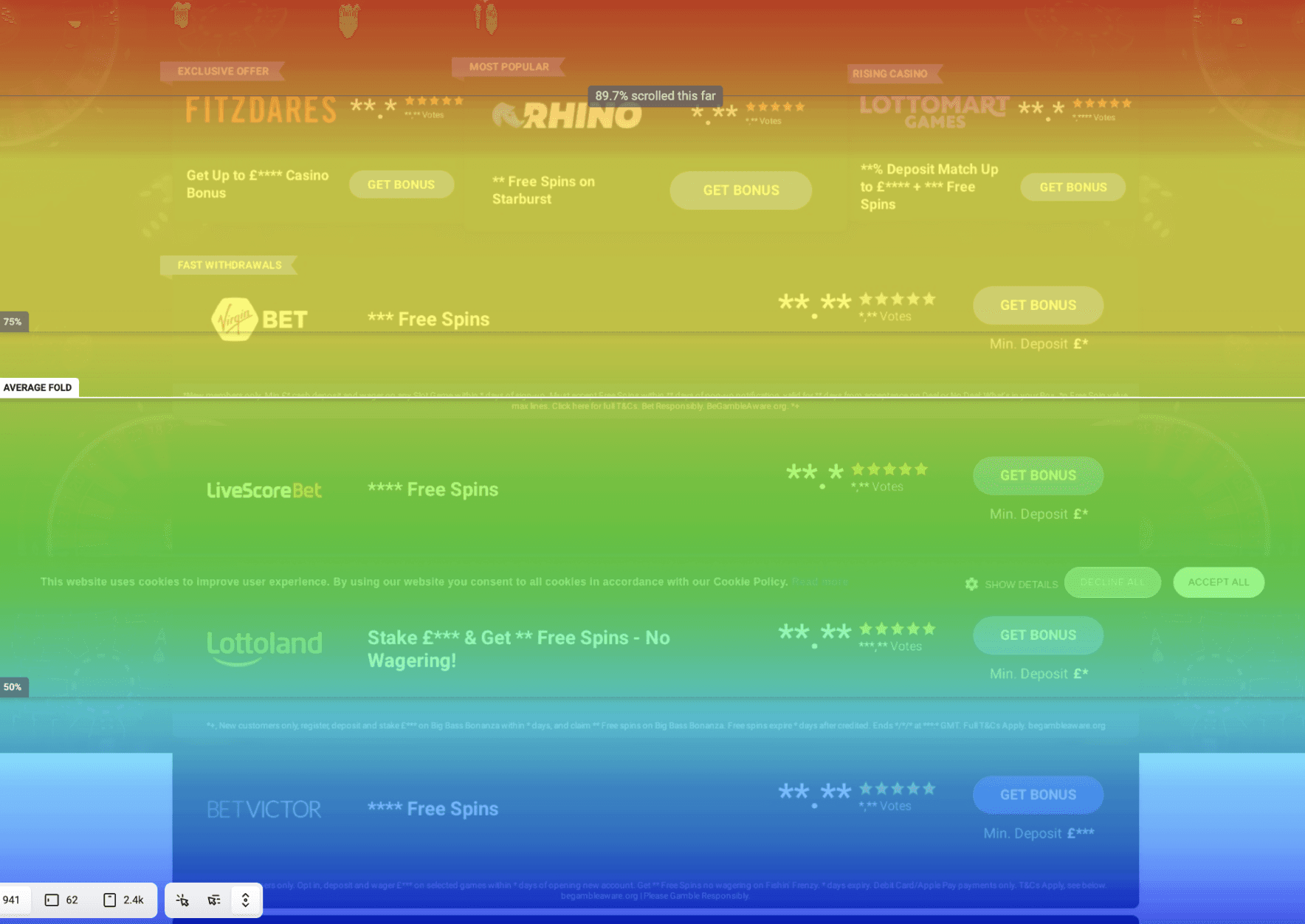

01
Narrow card layout
Implemented to showcase more brands on the first screen of scrolling, addressing the user's preference for efficiency.
02
Trust section
An additional field highlighting offers for new customers, aiming to address concerns about reliability and trustworthiness.
03
Mobile first
Optimizes the template for mobile devices, ensuring a user-friendly design aligned with the 80% of interactions occurring on mobile platforms.
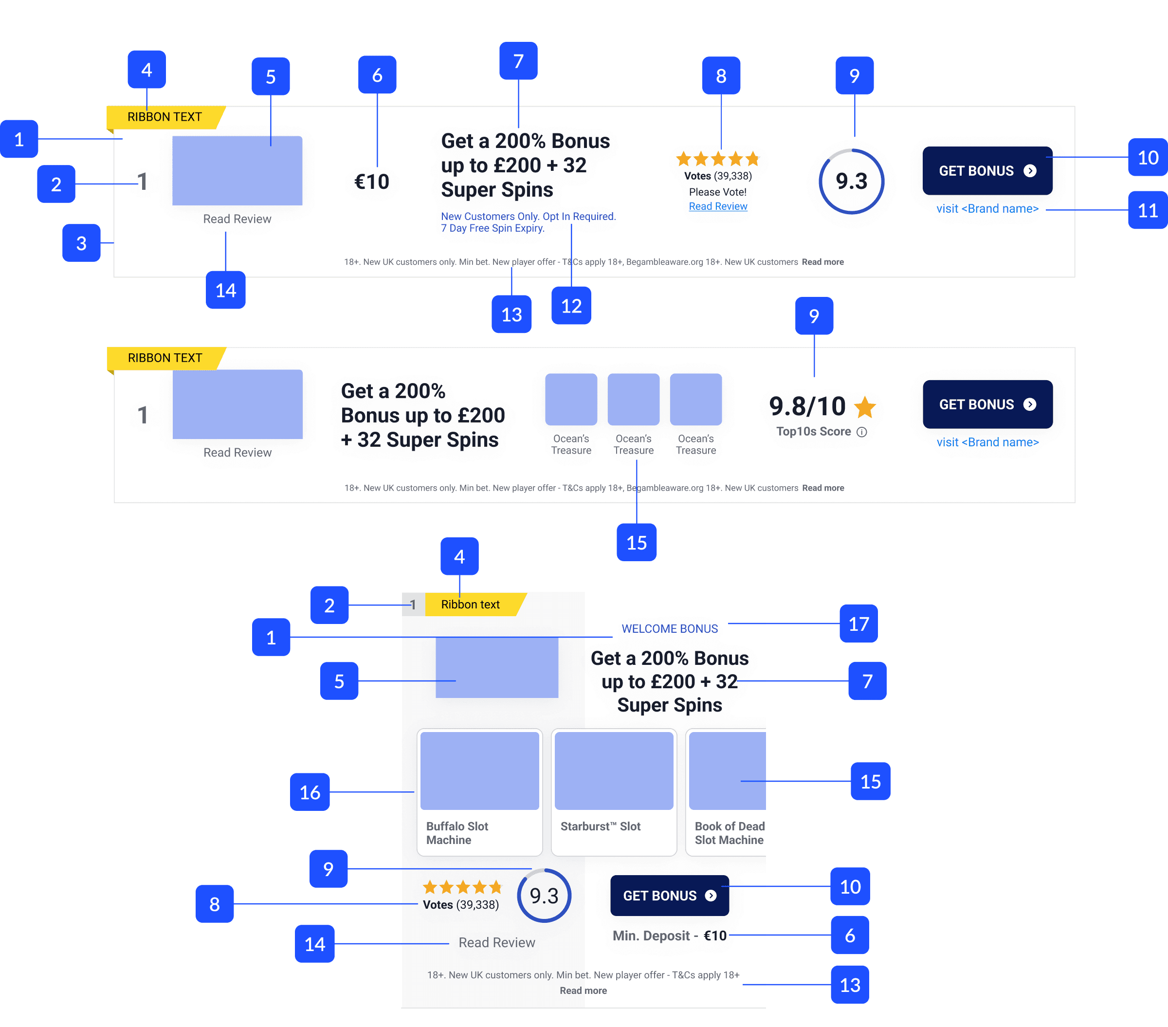
UX | Card Wireframe
1
Card Background
2
Number
3
Stroke
4
Ribbon
5
Logo
6
Min. Deposit
7
Number
8
Stroke
9
Ribbon
10
Logo
11
Card Background
12
Number
13
Stroke
14
Ribbon
15
Game Logo
16
Card Background
17
Number
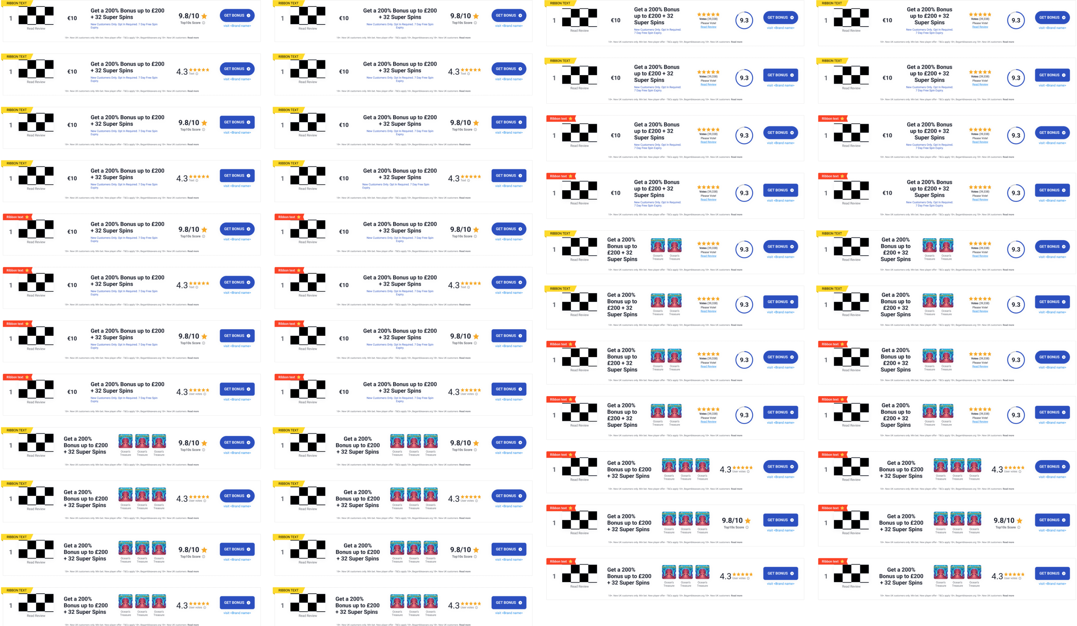
Template variations
UX | Compare page Wireframe
UI | Table variability
0525806831
